Stand Alone Supps
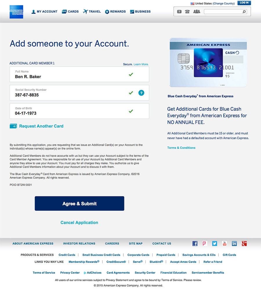
When a current American Express Card Member wants to add an Additional Card for their spouse or child or anyone, they work through a Stand Alone process requesting a supplementary ("Supp") card.
- UX Design
- UI Design
- Information Architecture
- ClientAmerican Express
- DepartmentMy Card Account
- DateMarch 2016
The Problem
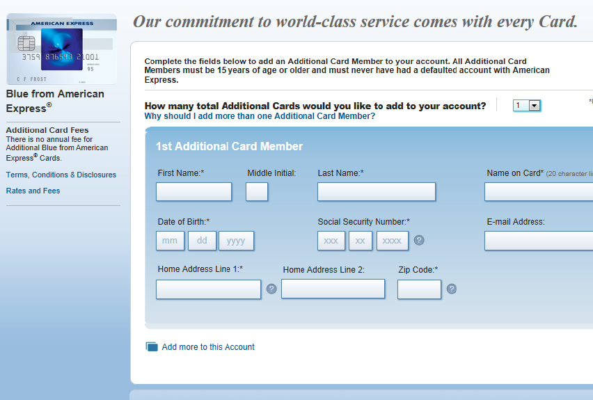
The SAS platform has not been updated in years. The redesign needs to incorporate the latest brand styling and be re-vetted for Compliance.
Research
When users are asked if they want to add Additional Cardholders at the time they complete the initial application, there are only three fields to complete. Why does SAS ask for so many more fields? Is Amex saving that data, and is it in legal compliance to ask for it?
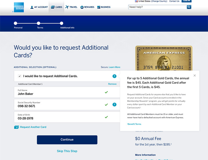
Amex's Long App page asks for the Supp's Name, Social Security Number and Date of Birth
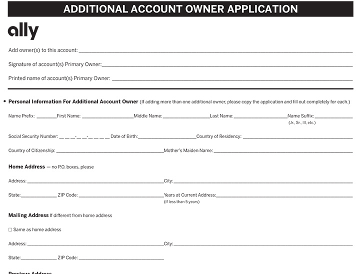
I don't have another credit card, but my bank, Ally, has a downloadable form that asks for Driver's License, Citizenship and more!
UI Enhancements
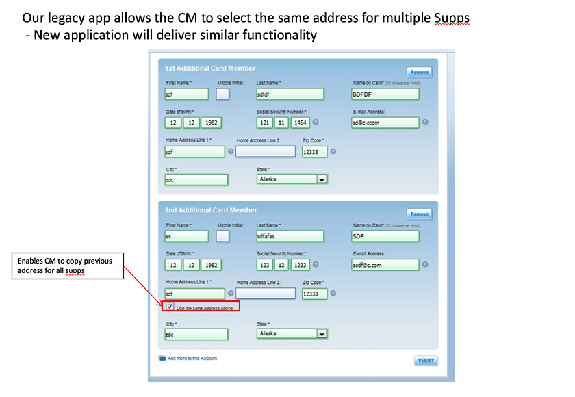
When users add a second Supp on the legacy app, there's an option to easily copy the address from the first entry, but I was sure there was a better way to skin that cat. It was still unclear whether we needed to ask the user's address, but I proposed an alternative.
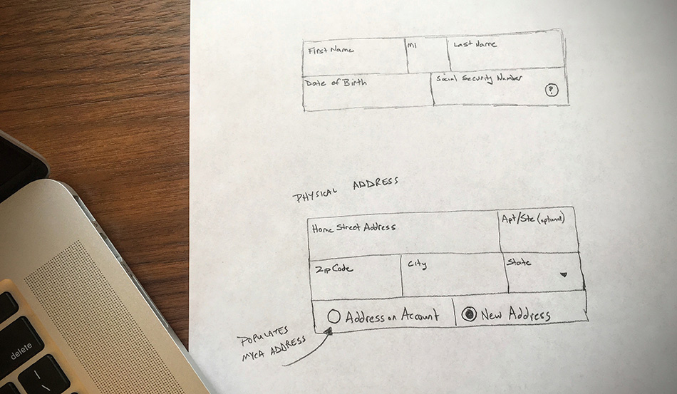
Research showed the large majority of users adding Additional Cards were entering their address on account, so my solution was to pull in the address on account, allowing the user to enter a different address.
1st Iteration
Sketches were turned into low-fidelity, then high-fidelity wireframes for legal and compliance review.
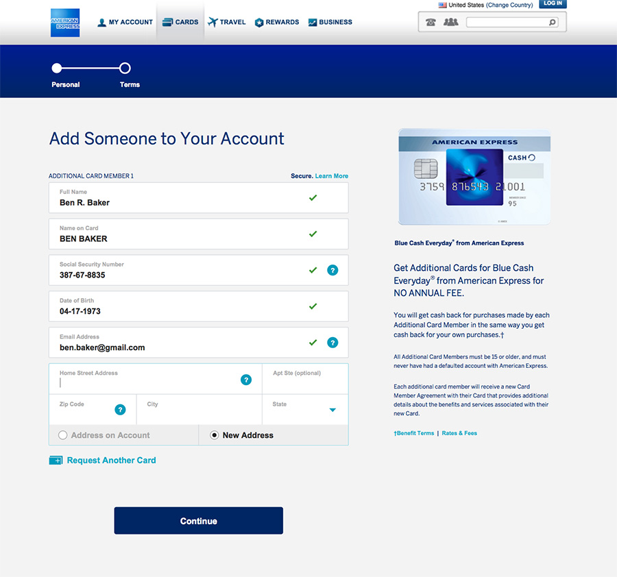
Blending the existing UI with the new elements, I delivered a full visual design PDF with desktop, tablet and mobile versions. Radio buttons for the address field were switched, but the tech team said we had the ability to pre-populate the field.

3rd Iteration
The marketing team reviewed my work and updated the placeholder text. Login step was removed from the wizard and ability to skip with the "No, Thanks" CTA was removed, as it was an unnecessary carryover from legacy.
Multi-Colored Supps
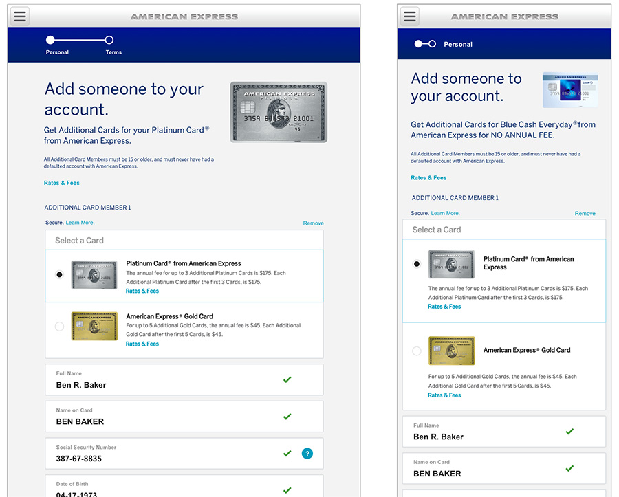
Cards within the same "family," like Platinum, Gold and Green, allow the user to select whether they want to issue their Supp a similar Platinum Card (with the higher annual fee), or the Gold Card.
I created the UI elements for desktop, tablet and mobile.
12th Iteration
Unfortunately, the business requirements that the Product Owner and I determined in the beginning were incomplete. After the Legal and Compliance Departments got their review, the Terms page was removed and that text was moved to the application page.
It was also found that we shouldn't be asking for the user's address, email and name on card. Lastly, while I had sketched and mocked up a condensed fieldset, the MVP launch only had time for the developers to reuse components.
